
One of the most expansive and informative projects of my career so far. The mission of creating a brand for Dan AKA Sasha Rome was to discover and build a brand that granted him self-sufficiency without sacrificing the quality of his visual identity. This meant not only figuring out what his brand identity consisted of, but also how it could be executed time and again with limited help from designers such as myself.
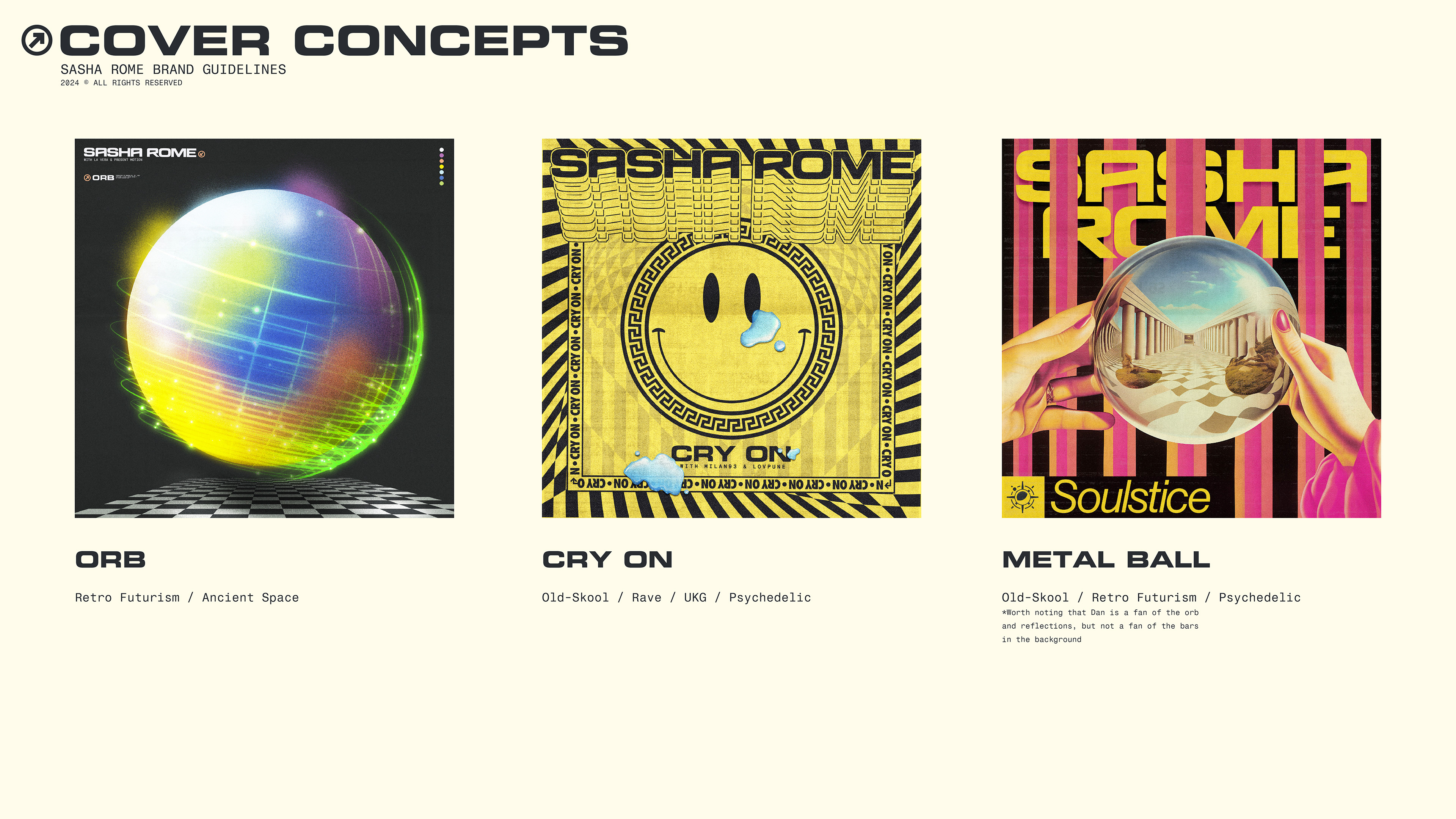
This process began like every other, with client-onboarding and some initial strategy calls; We were basically starting from nothing. There were some basic themes to work off of, like capturing Greek/Roman themes and imagery without being too obvious (i.e Columns). We also knew that we wanted to capture elements of Modern-Looking design, as well as leaving room for themes of space. All captured within a Word Mark and Icon. It was ambitious to say the least.
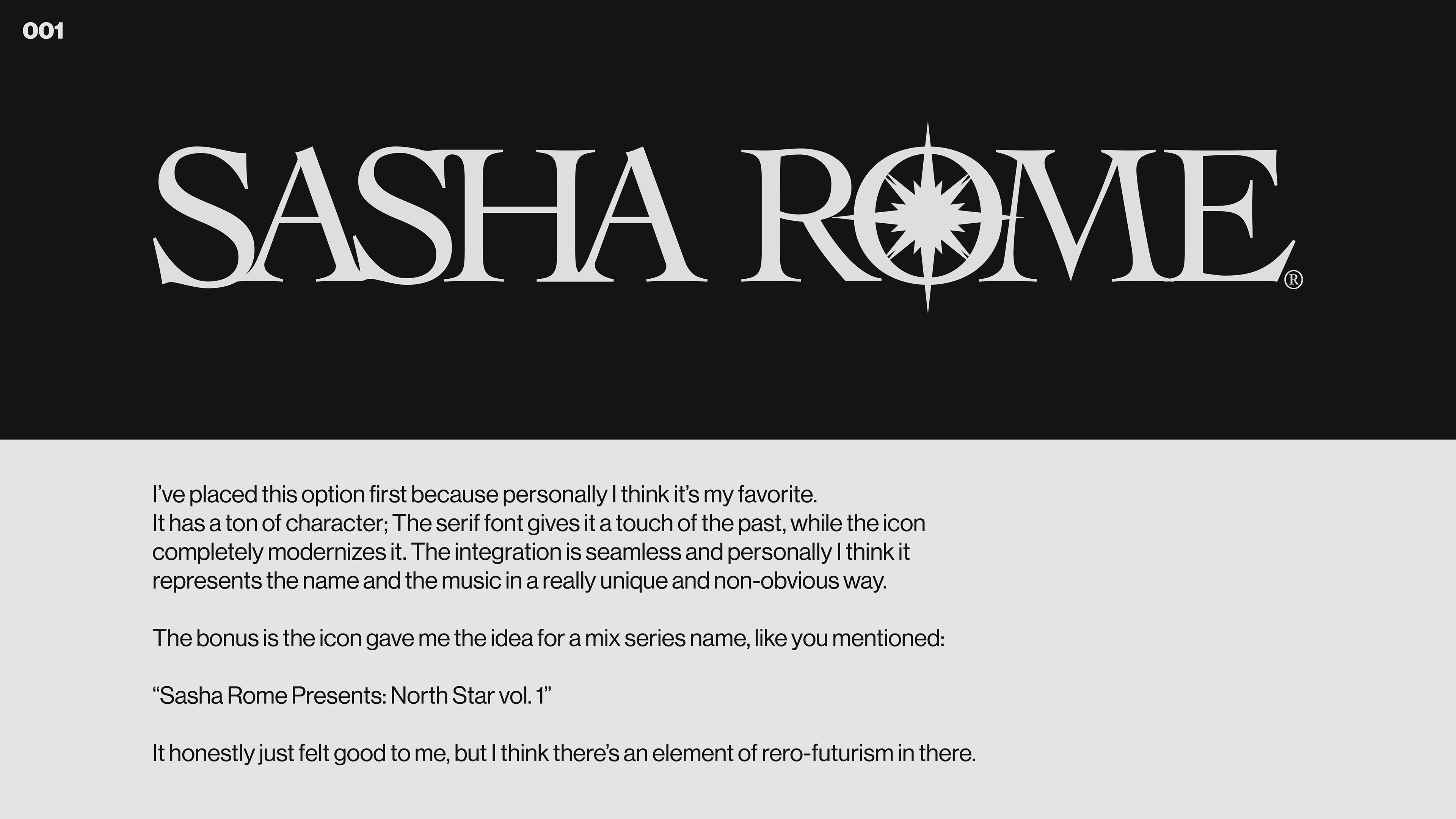
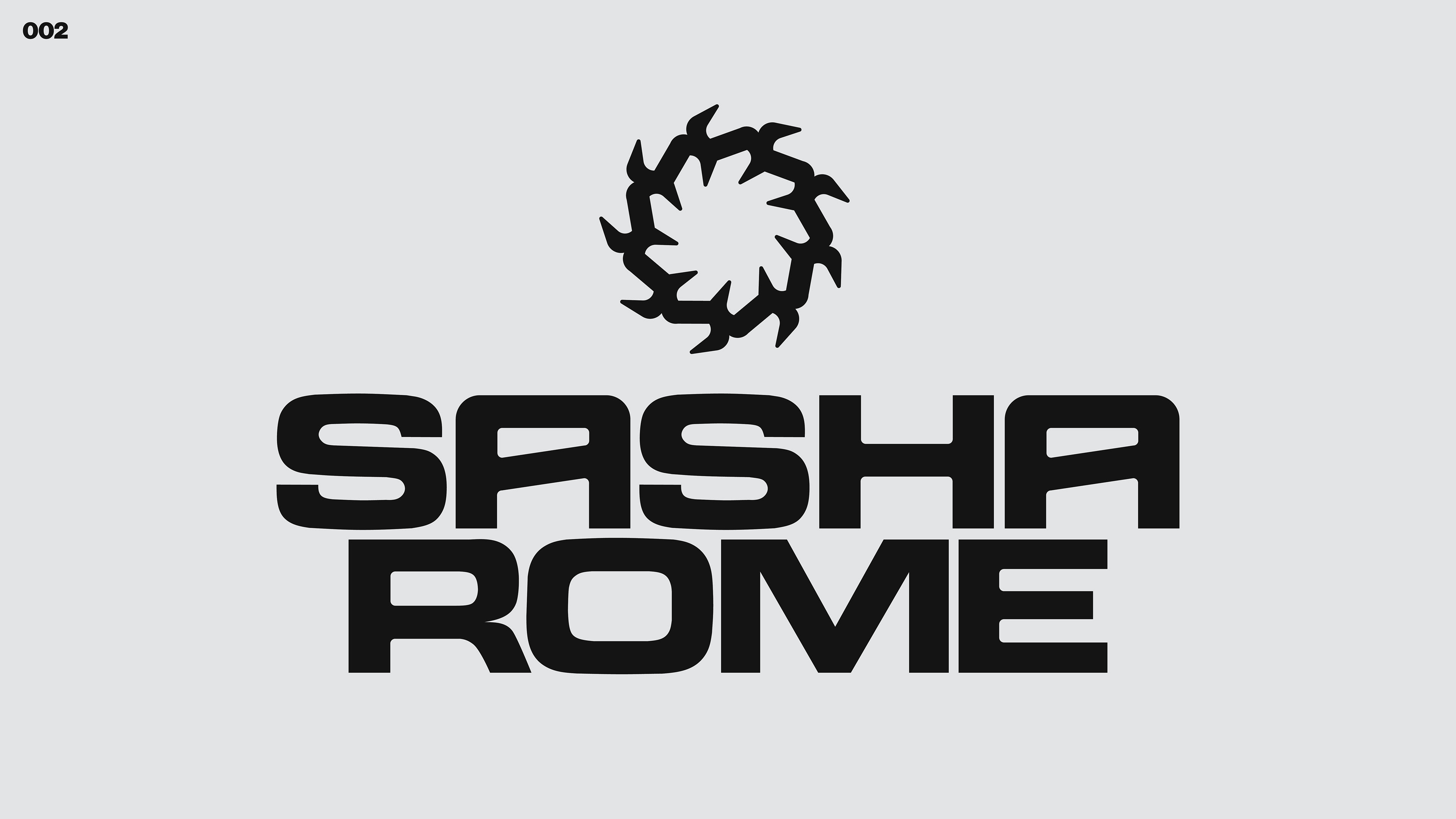
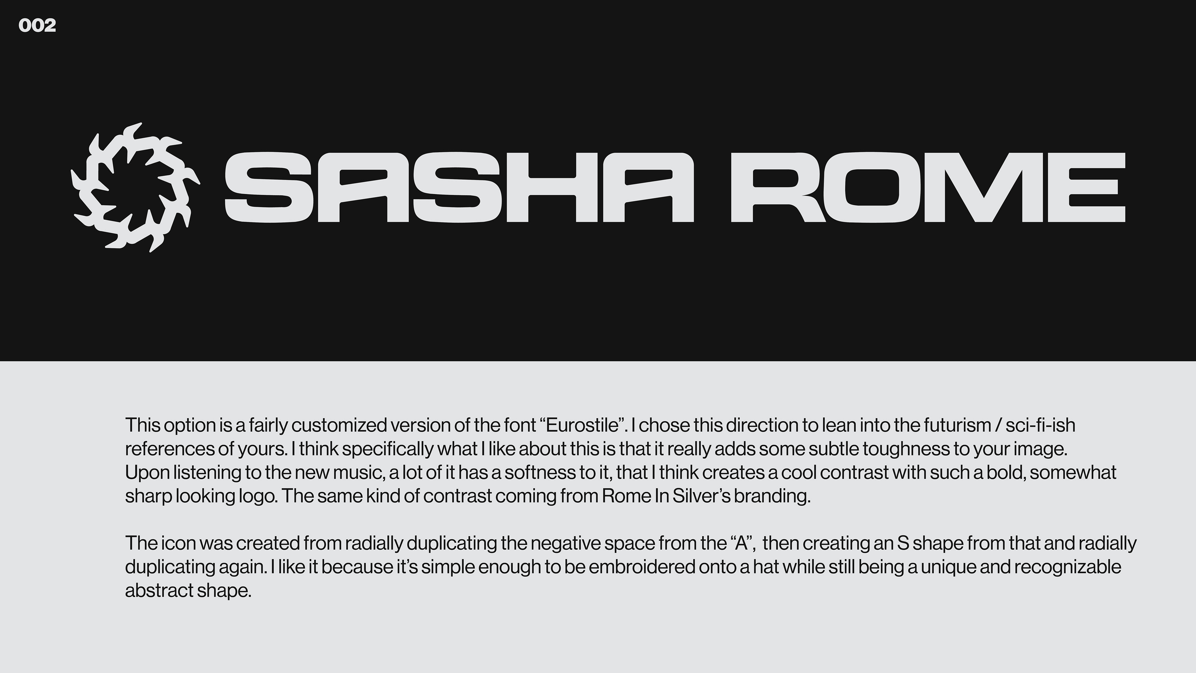
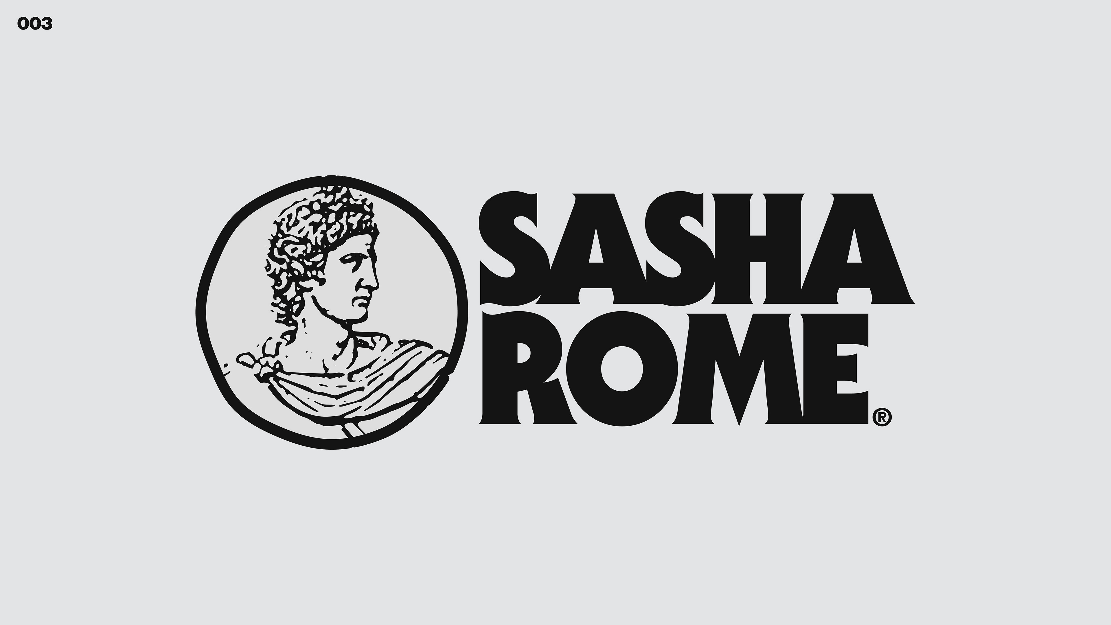
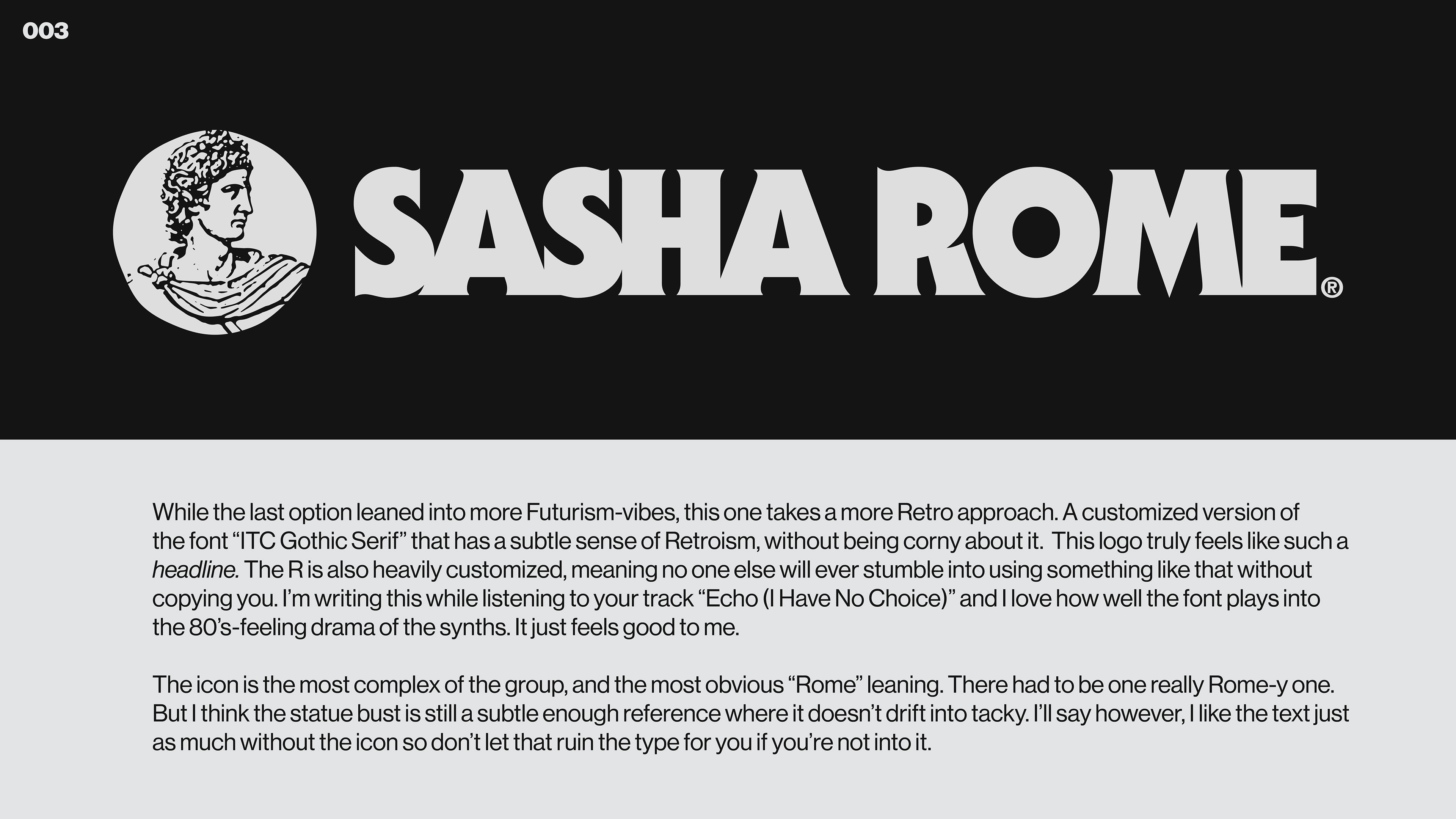
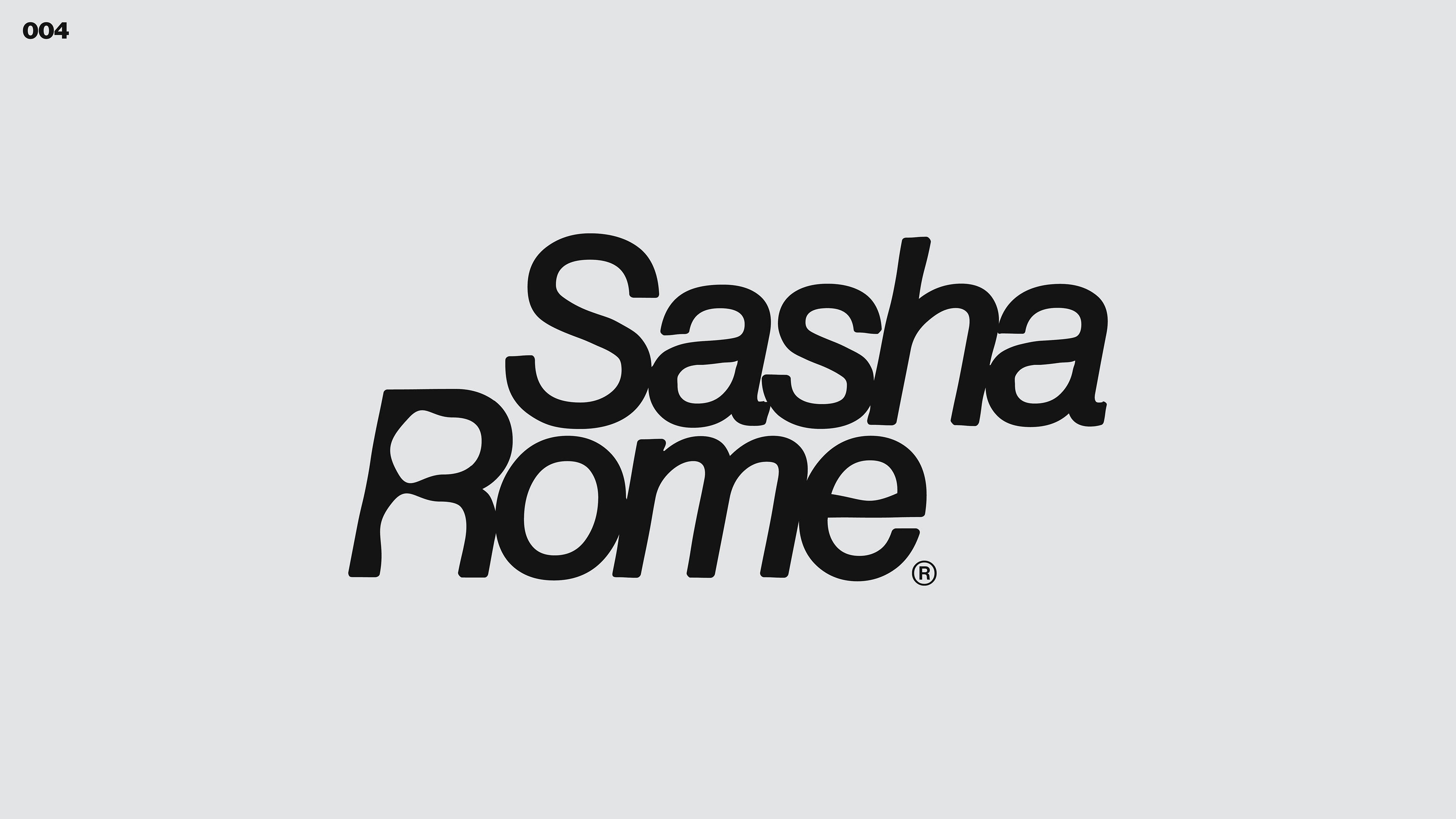
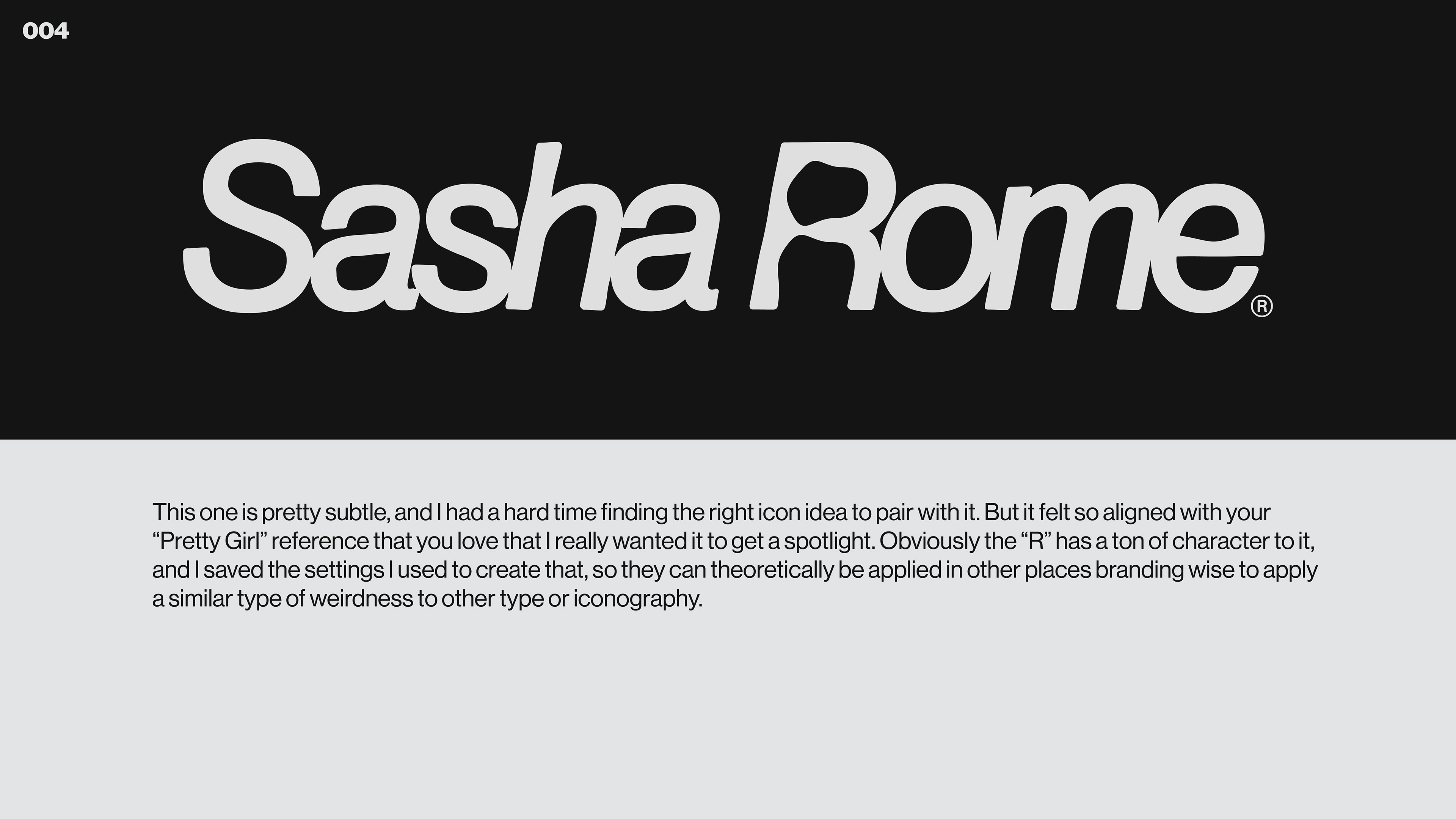
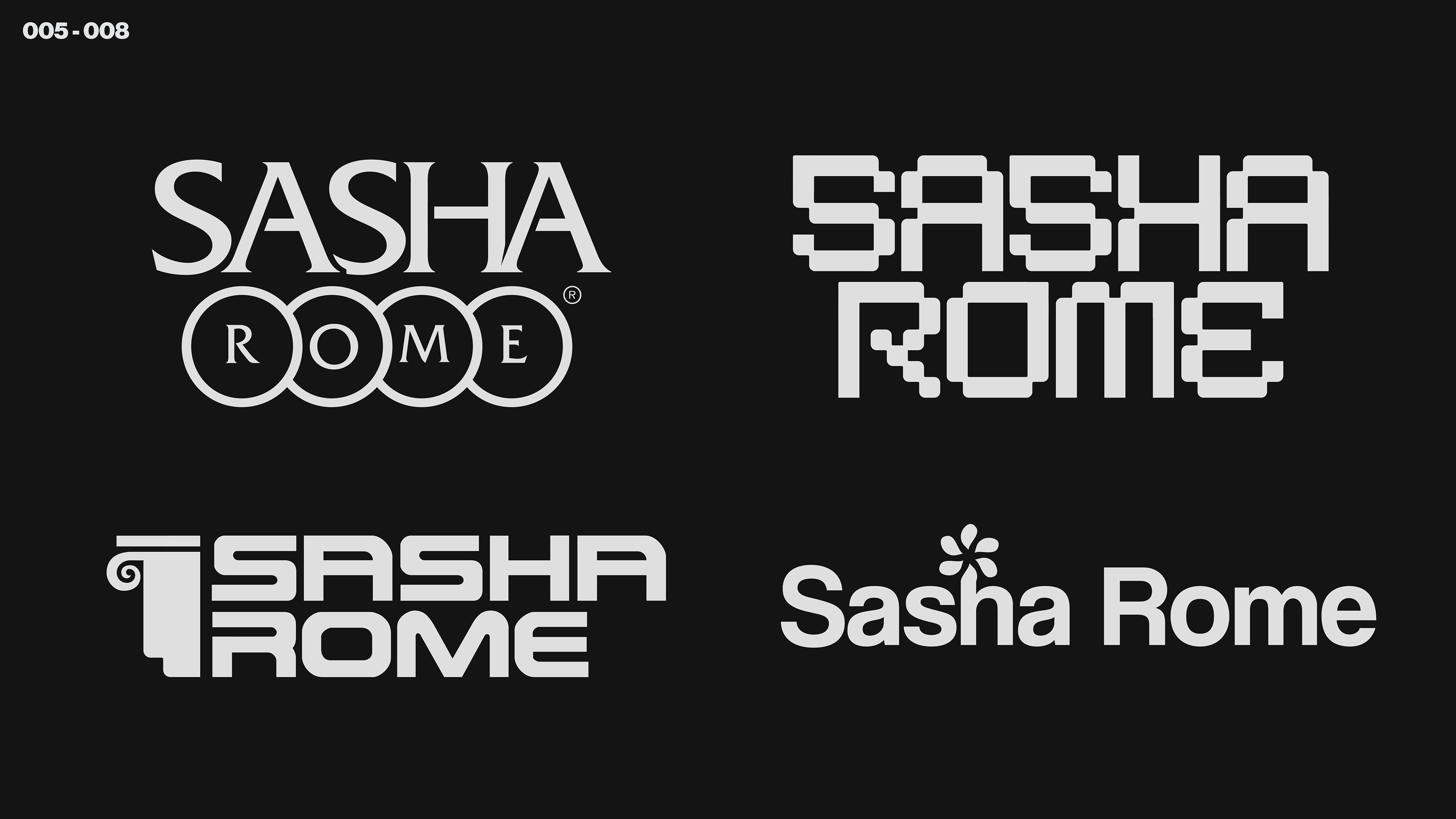
But in our soon-to-be-established typical fashion, we agreed to figure things out as we went through the power of iteration. What you'll find below was my first presentation of Logo Comps, with explanation alongside them.
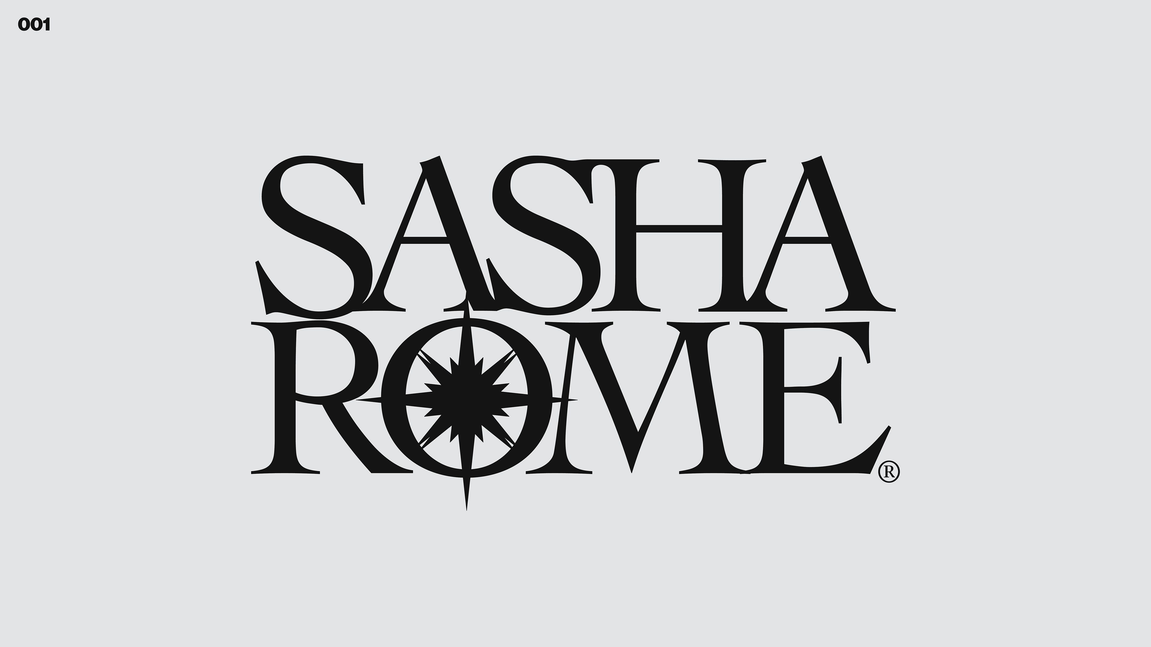
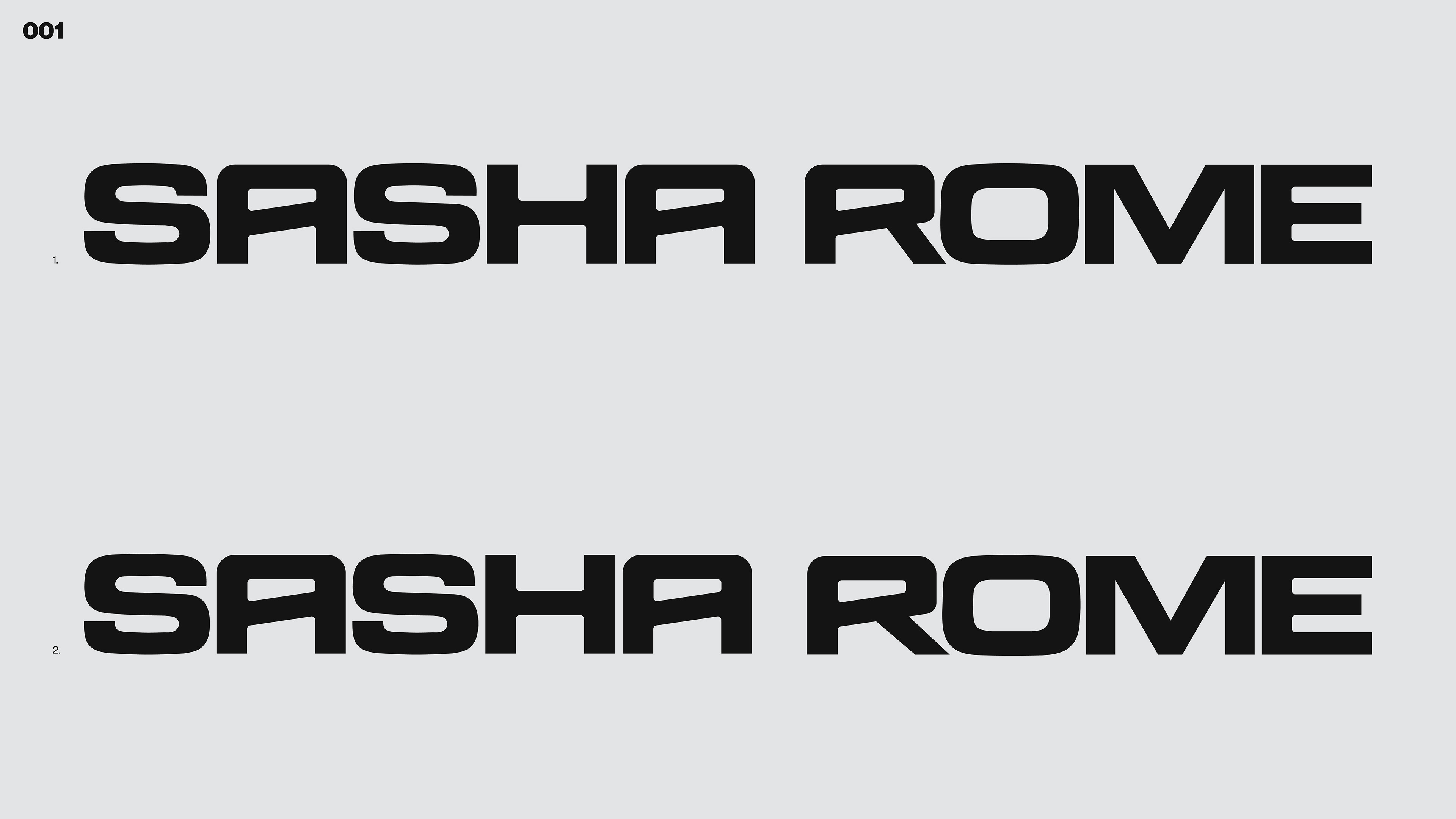
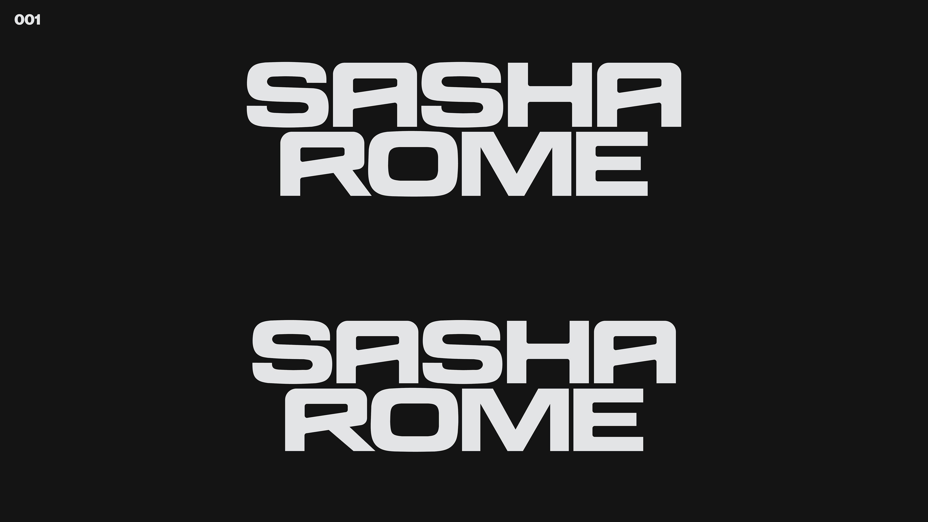
Then after a few rounds of feedback and revisions and many email and text conversations, we were able to narrow down to the following ideas:
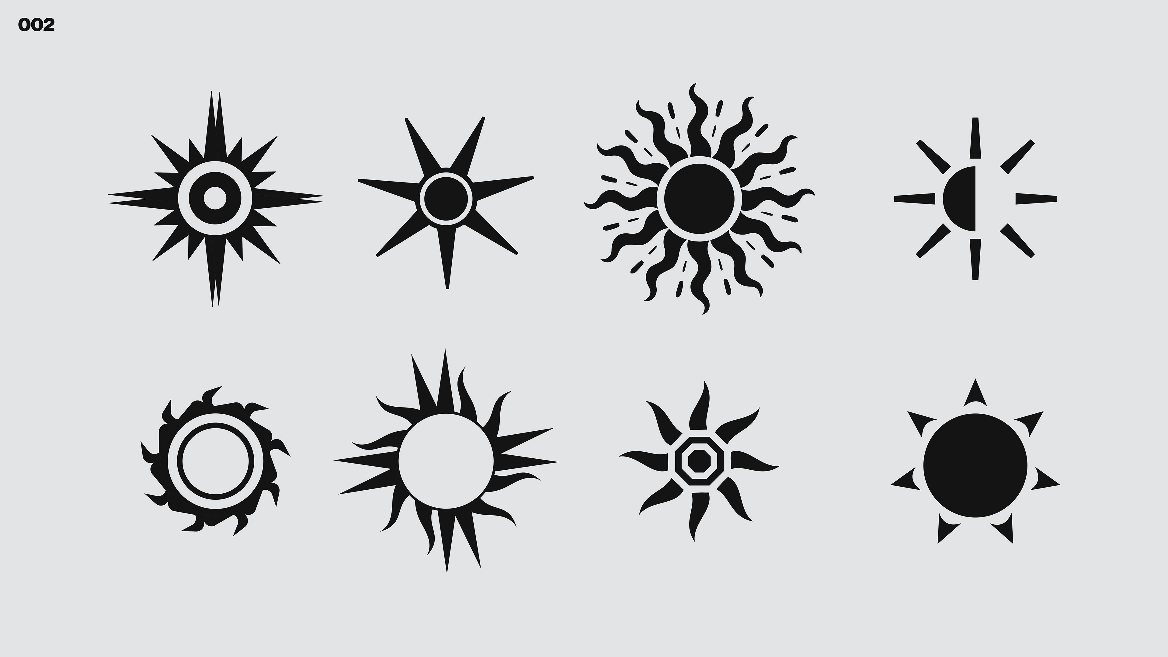
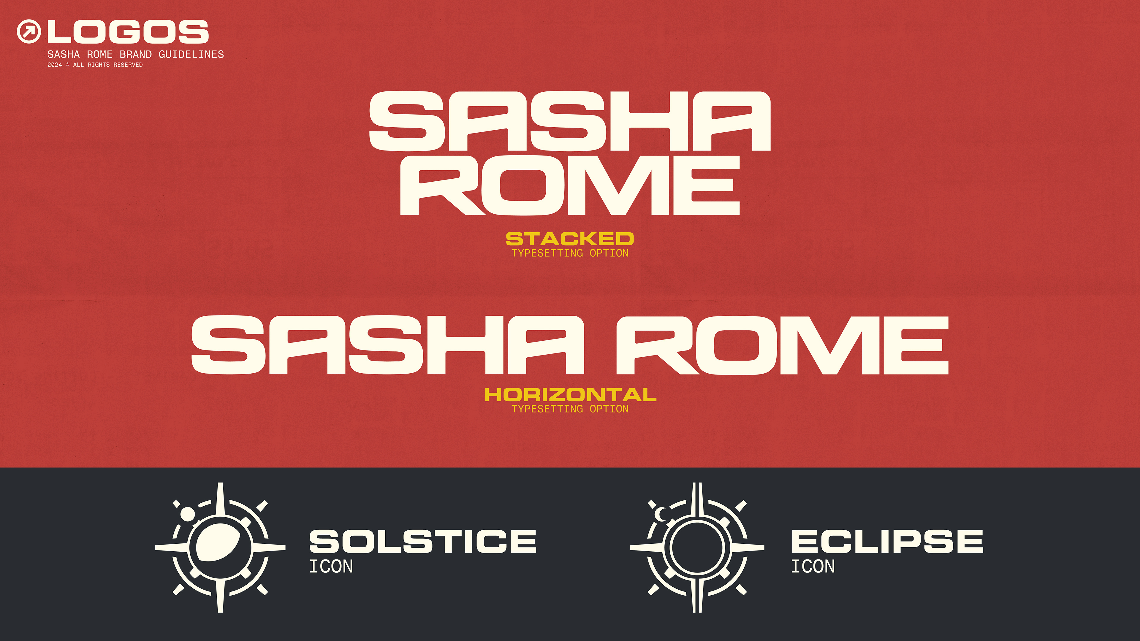
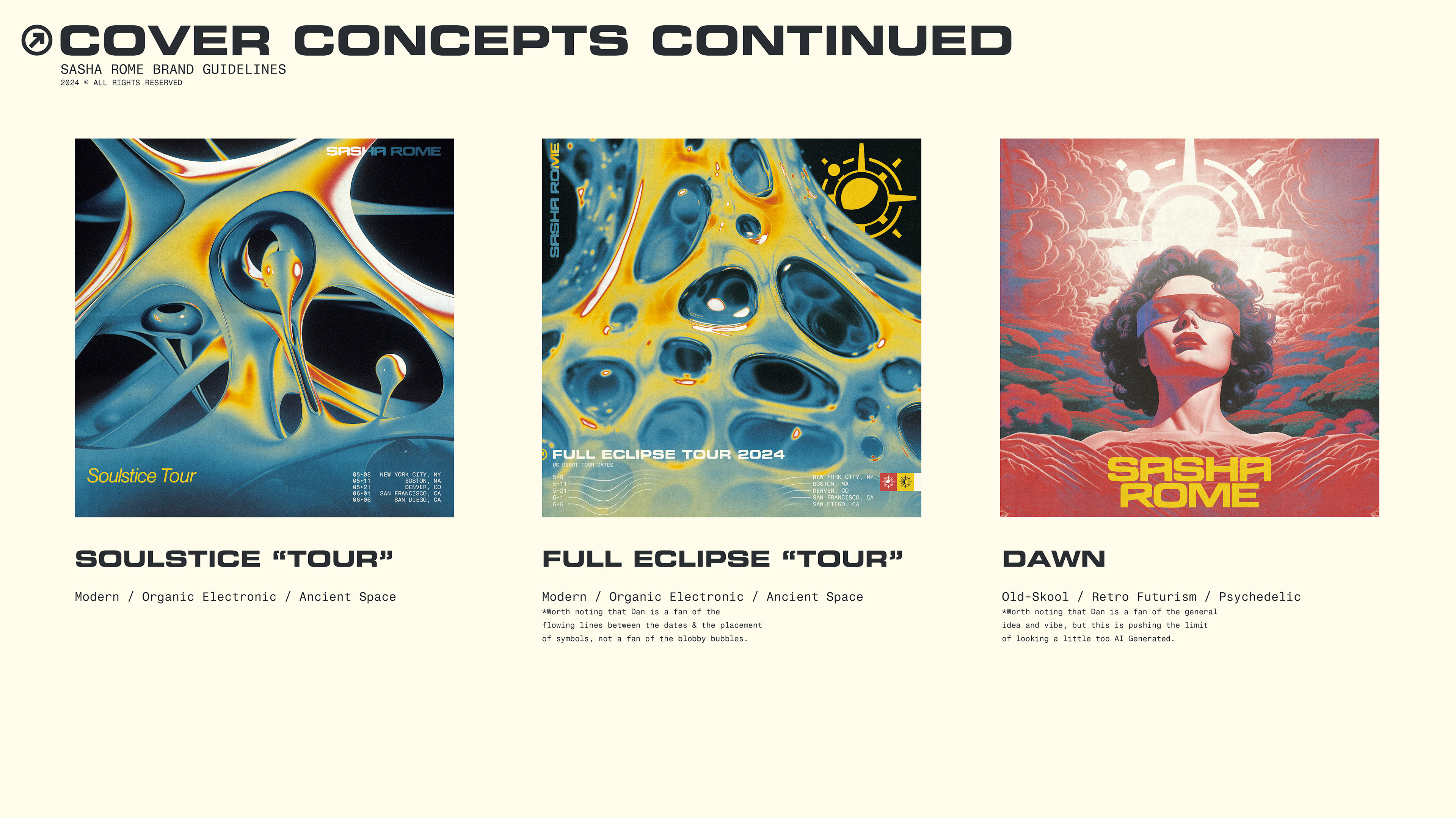
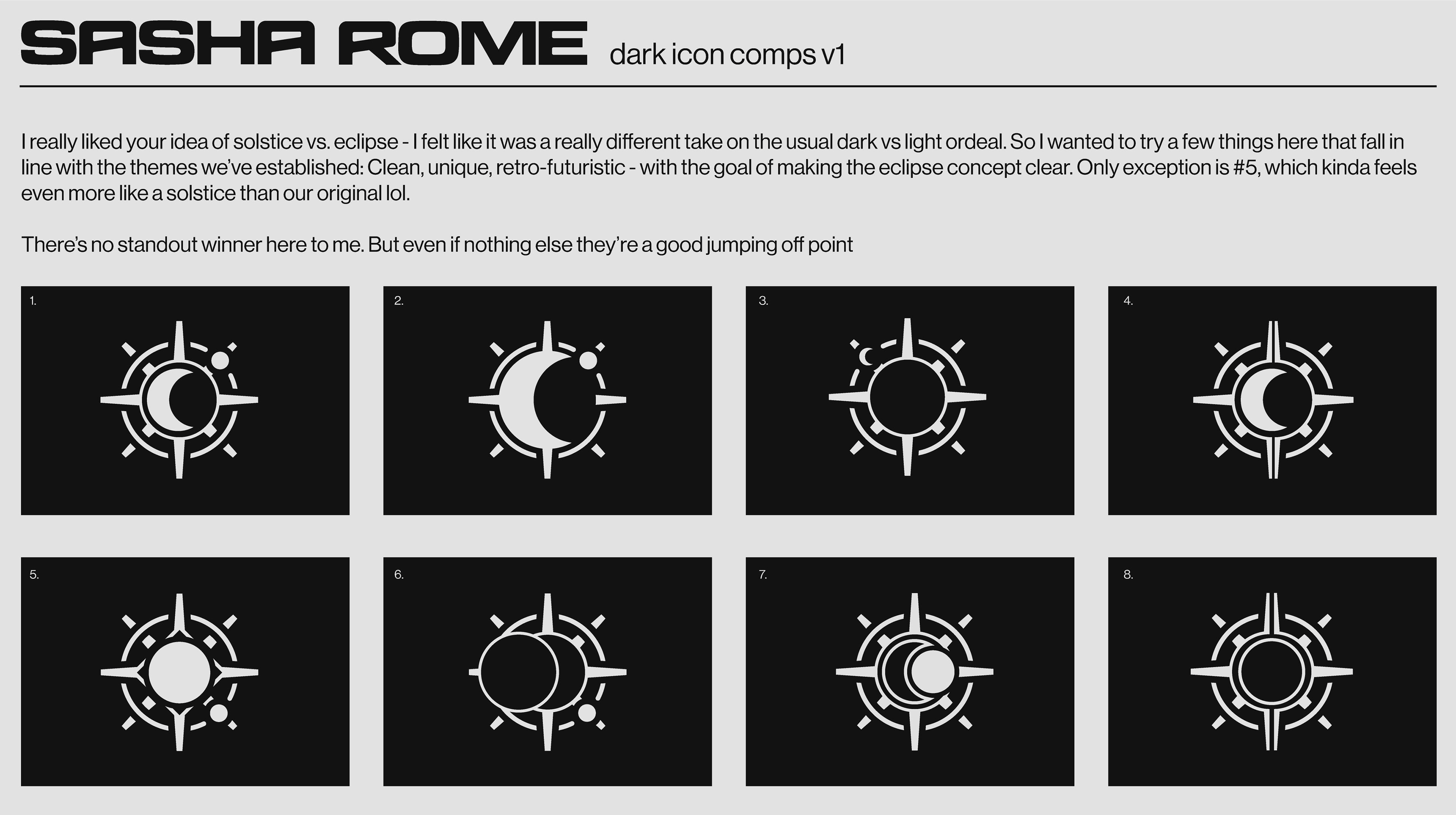
And after that, narrowed in on different "Light and Dark" Icons. Which then led us into the concept of Solstice and Eclipse; These later became the keystone of the entire brand identity system and affected every single decision we made moving forward

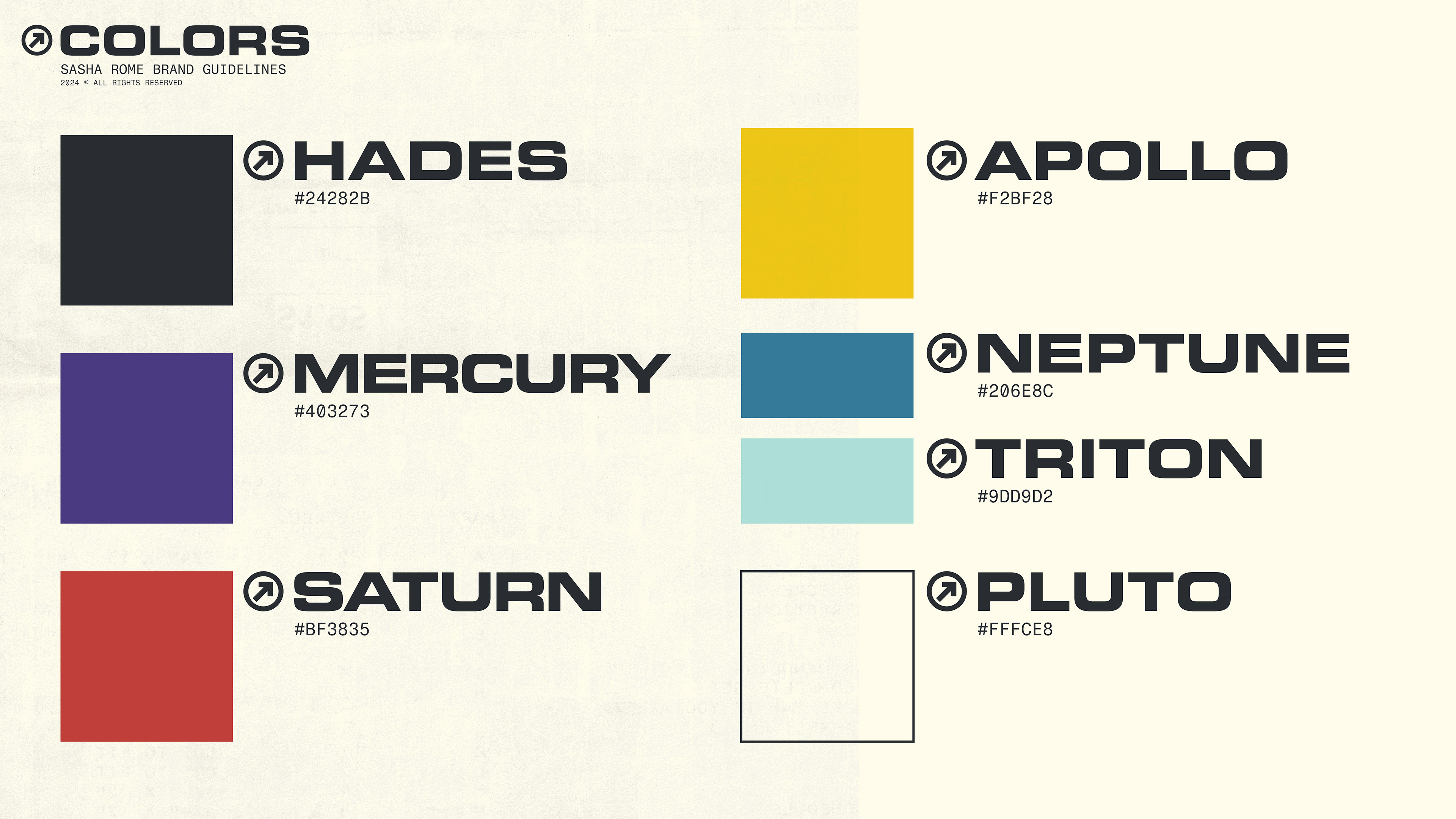
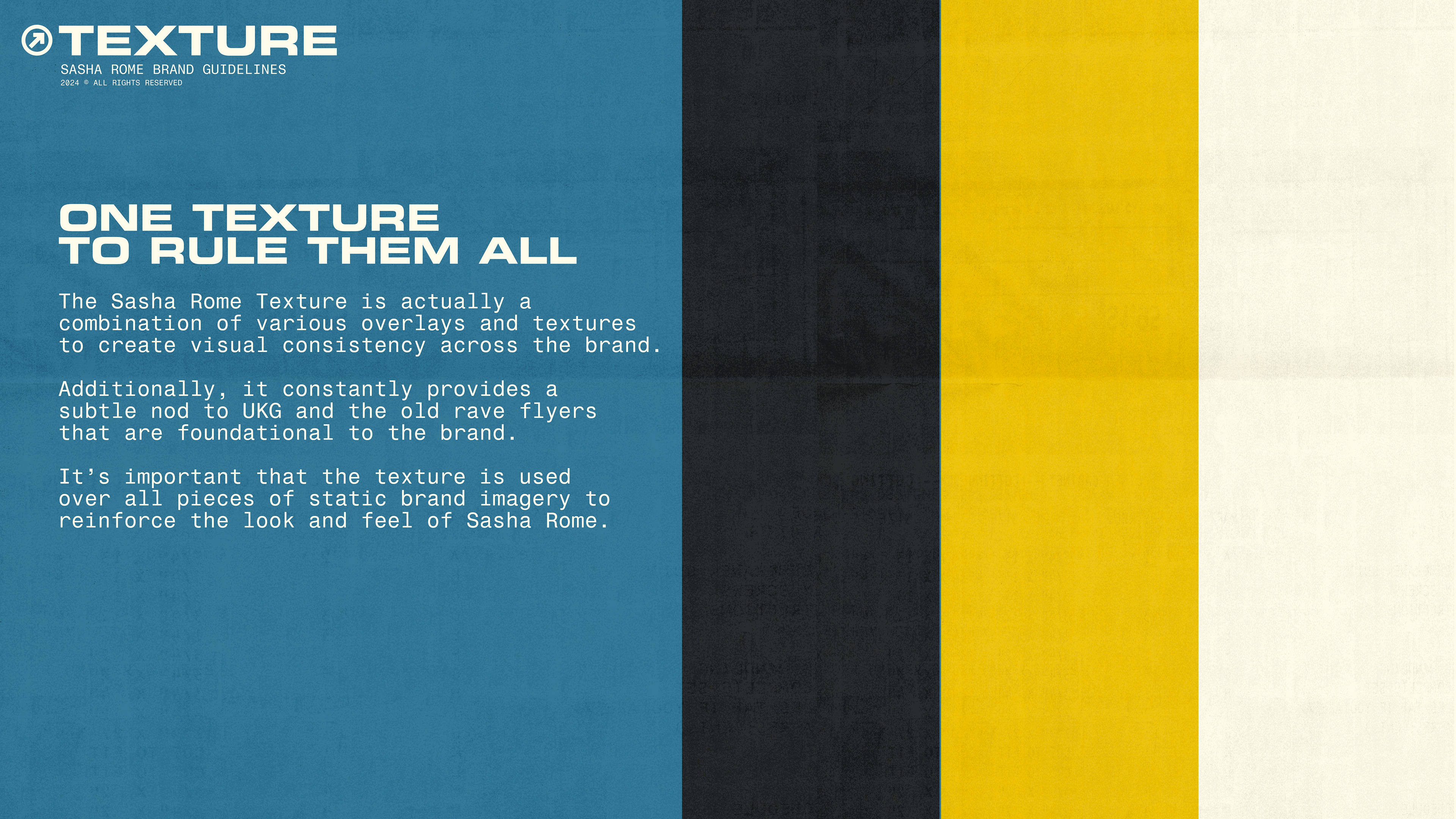
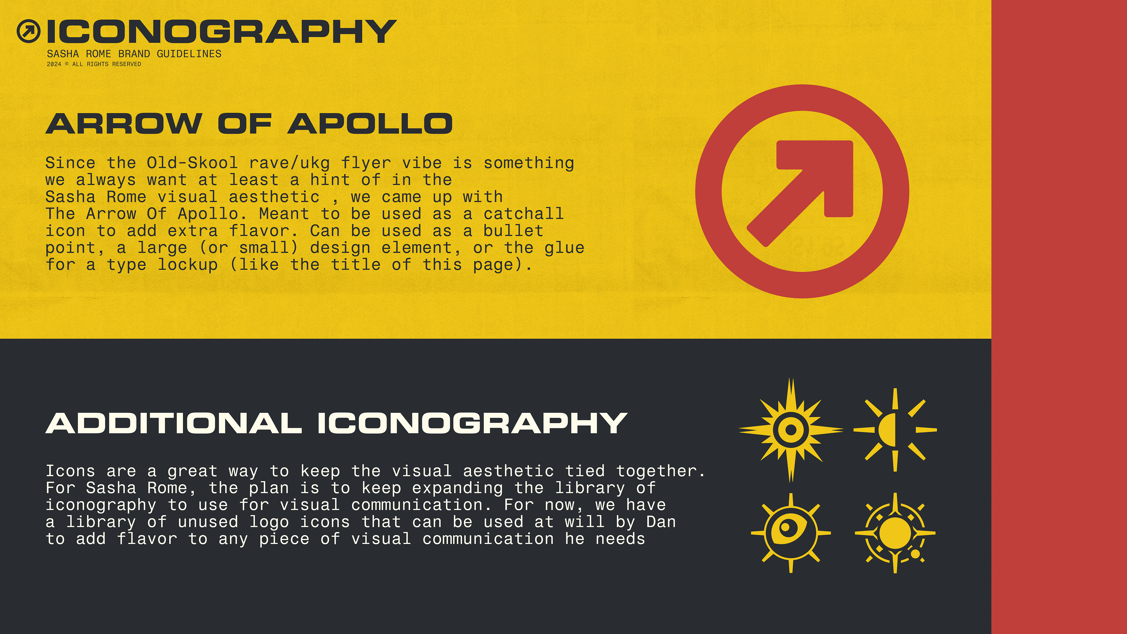
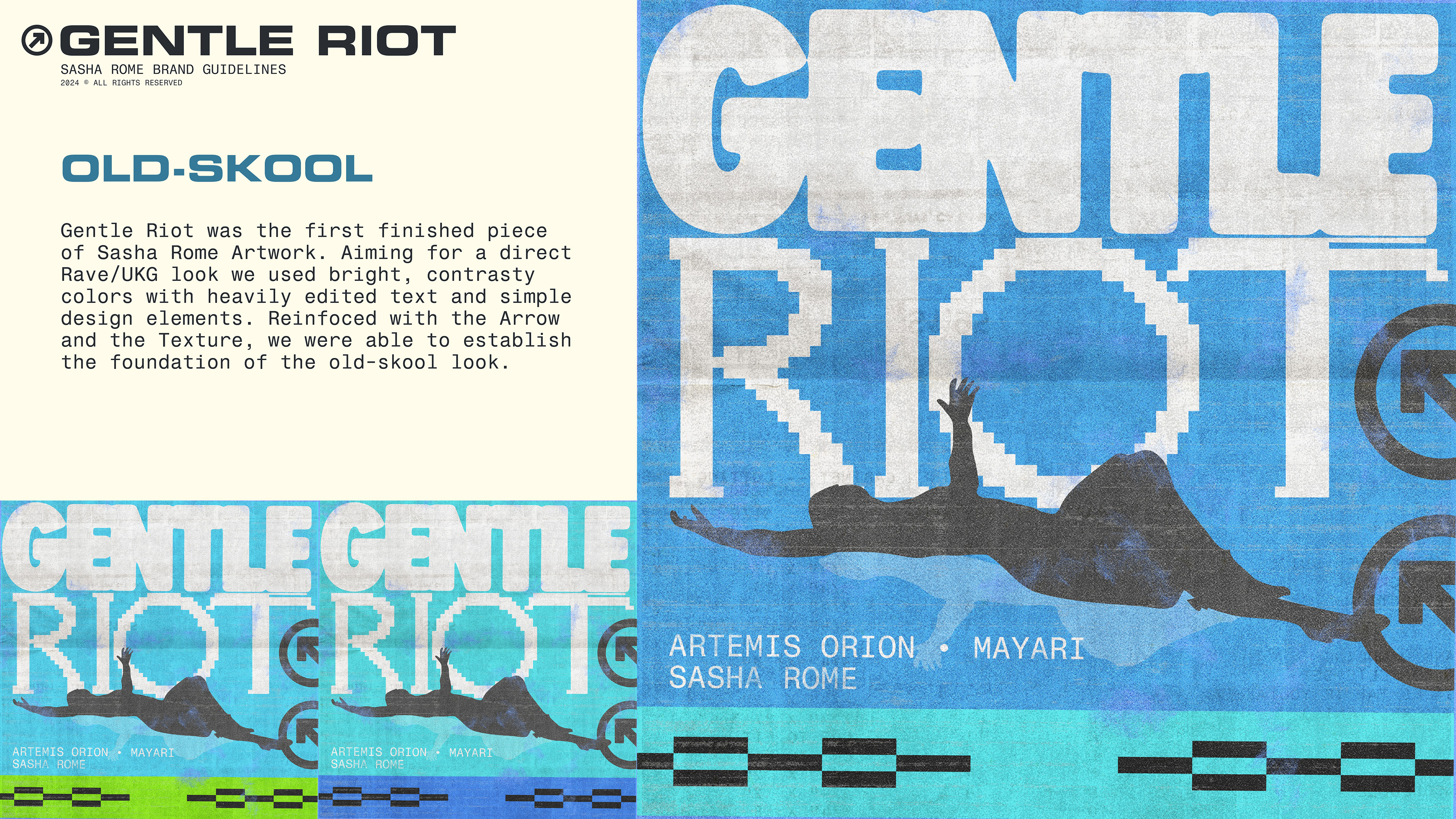
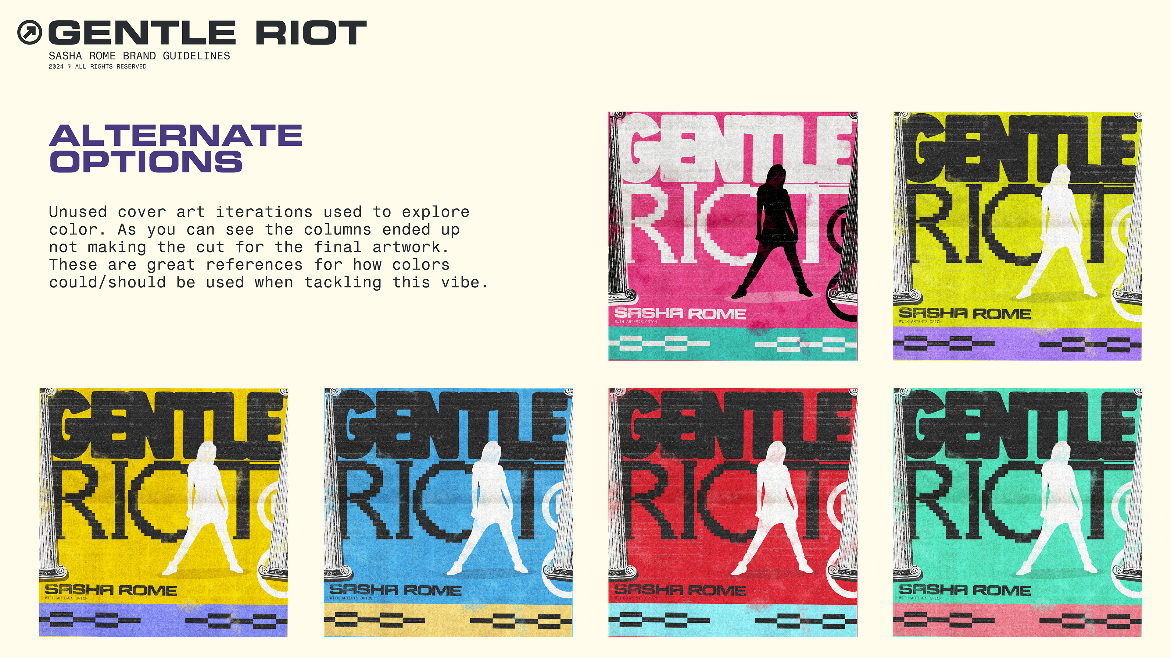
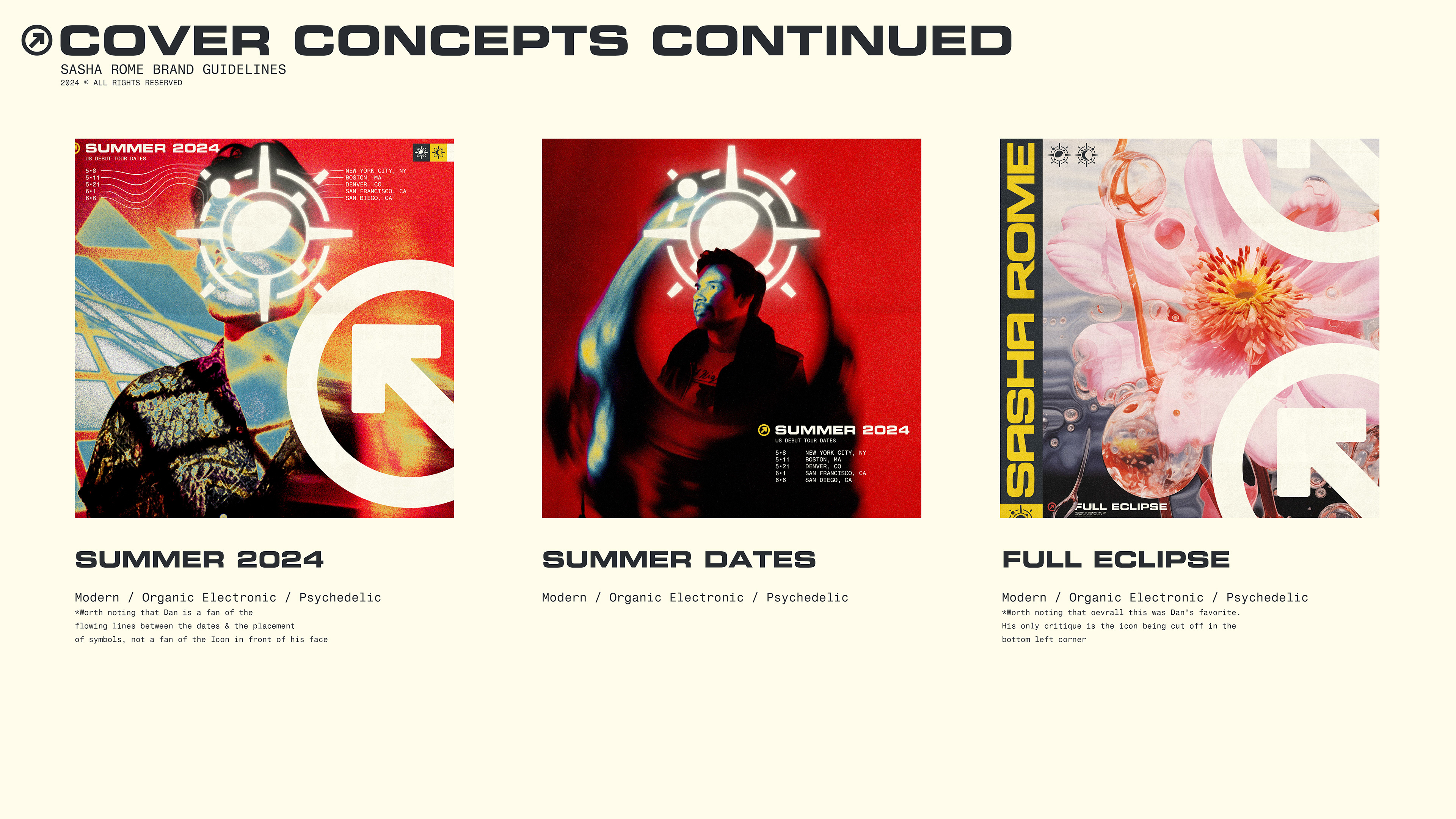
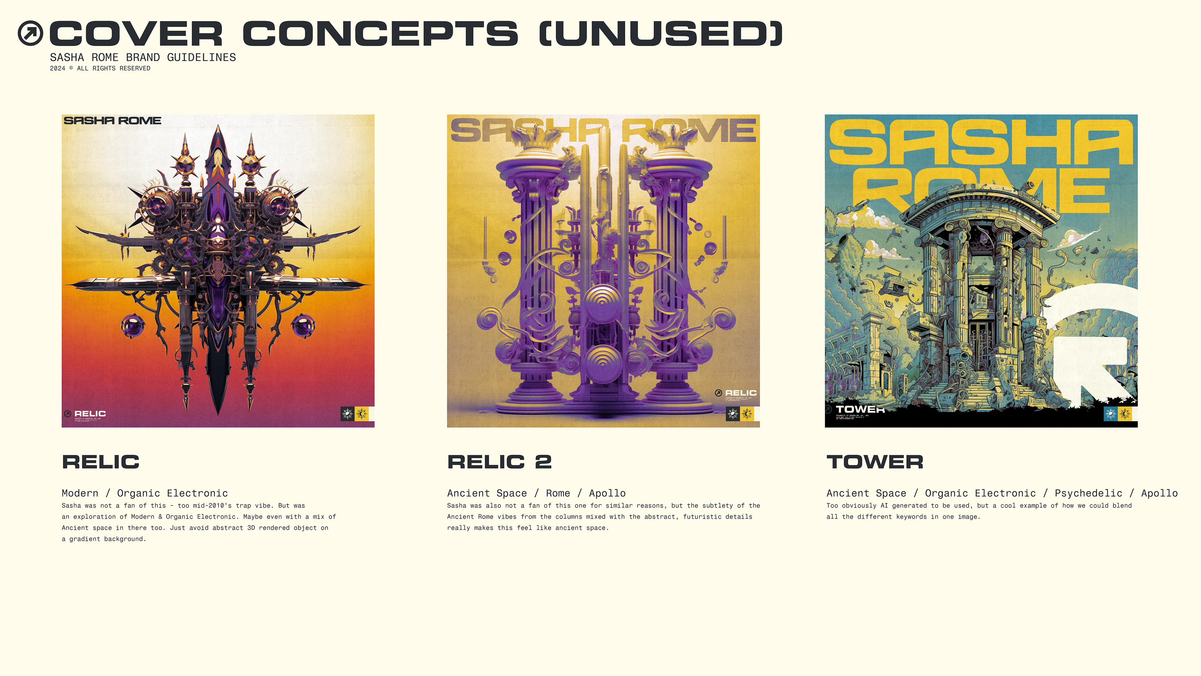
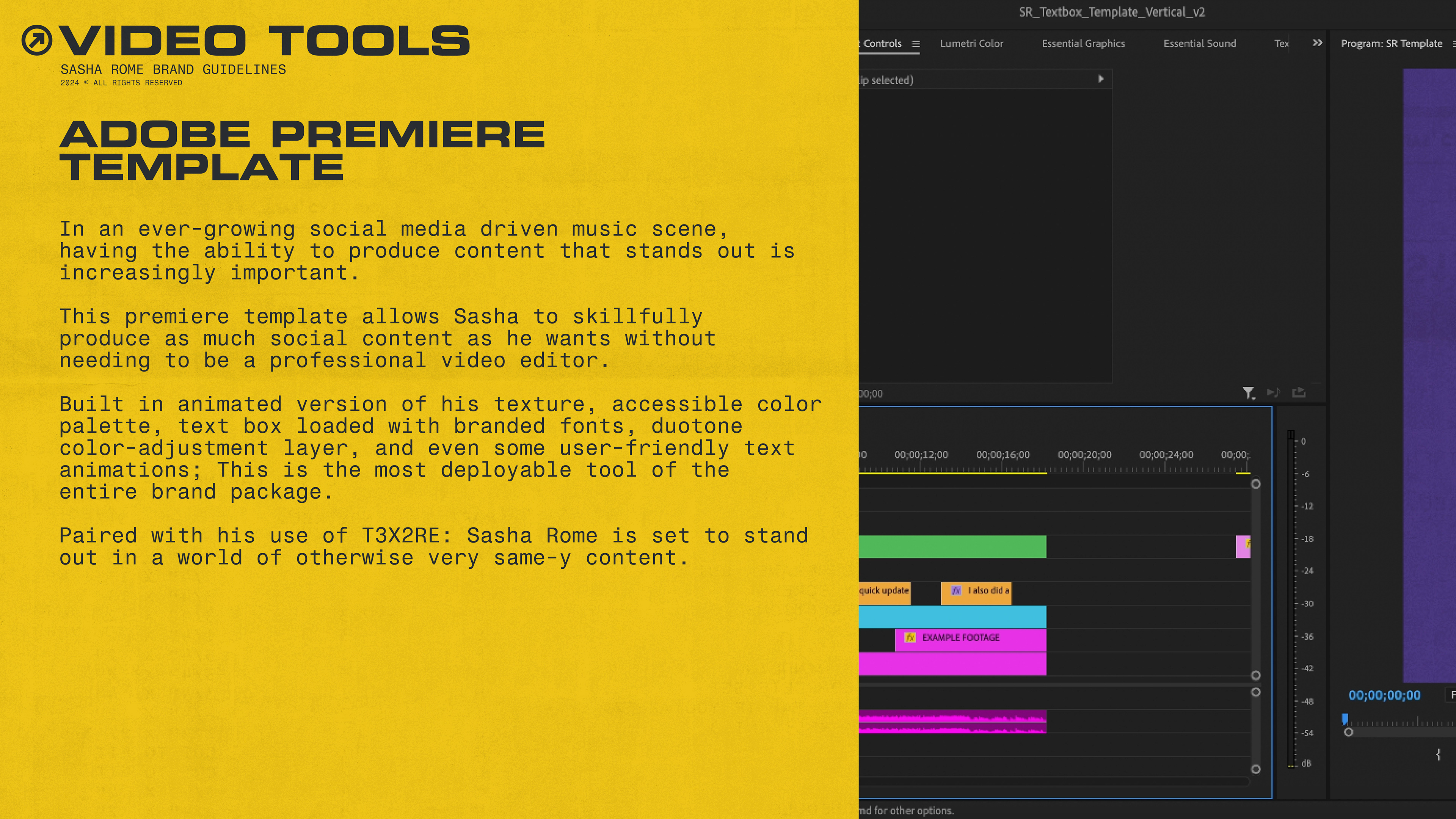
And finally once things were settled with the Word Mark and Icons, we moved on to Core Plus activities, that are better shown in the brand guide than explained here.
We ended up with an absolute monolith of a brand identity. A well oiled machine that Dan is able to operate on a day to day basis without the assistance of a certified® graphic designer.
The power of Sasha Rome's visual identity is in it's systems and preparation, as illustrated in the final brand guide below: